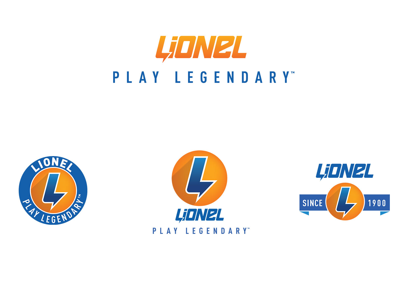
The makers of the first electric toy — Lionel — was once the most desired toy brand on the market. Their electric toy train sets represented American innovation and adventure for young kids. The quirky Lionel “L” symbol remains an iconic symbol from 1950’s Americana.
But times have changed, and so has childhood. As new technologies replaced coal and diesel fueled icons, Lionel had to evolve too. In preparation for their launch of new toys and entertainment, they wanted to explore what a rebrand would look like.
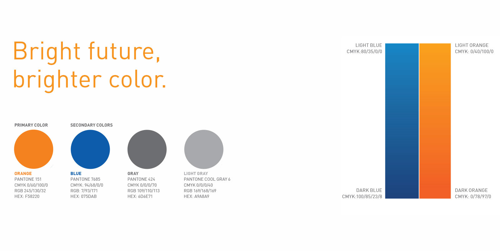
It was important to develop a brand that would be cool enough attract young kids, without feeling disingenuous to older customers still collecting their trains. Our work led us to a cool, modern, and playful brand system.
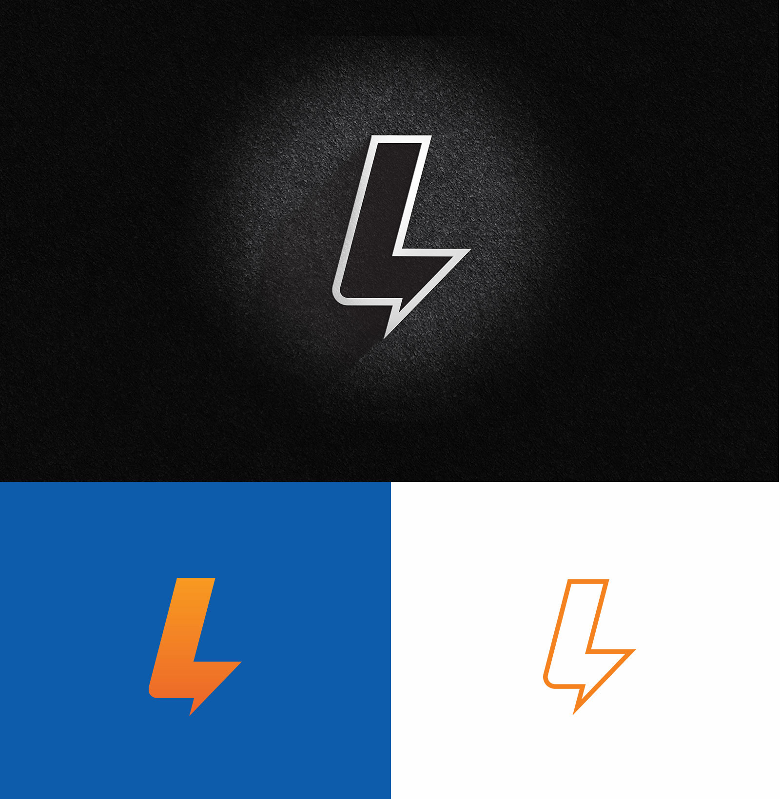
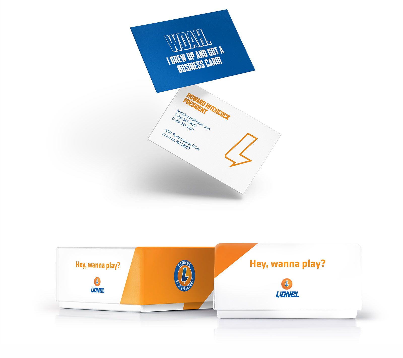
The logo itself embodies the energy of the brand. The slanted letters speak to speed and the “L” itself has a subtle lightning bolt incorporated into it’s form. The new “L” is unique enough to stand all on it’s own, hinting to a new world of adventure left to discover.