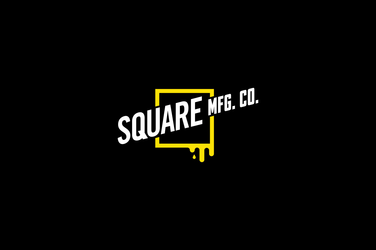
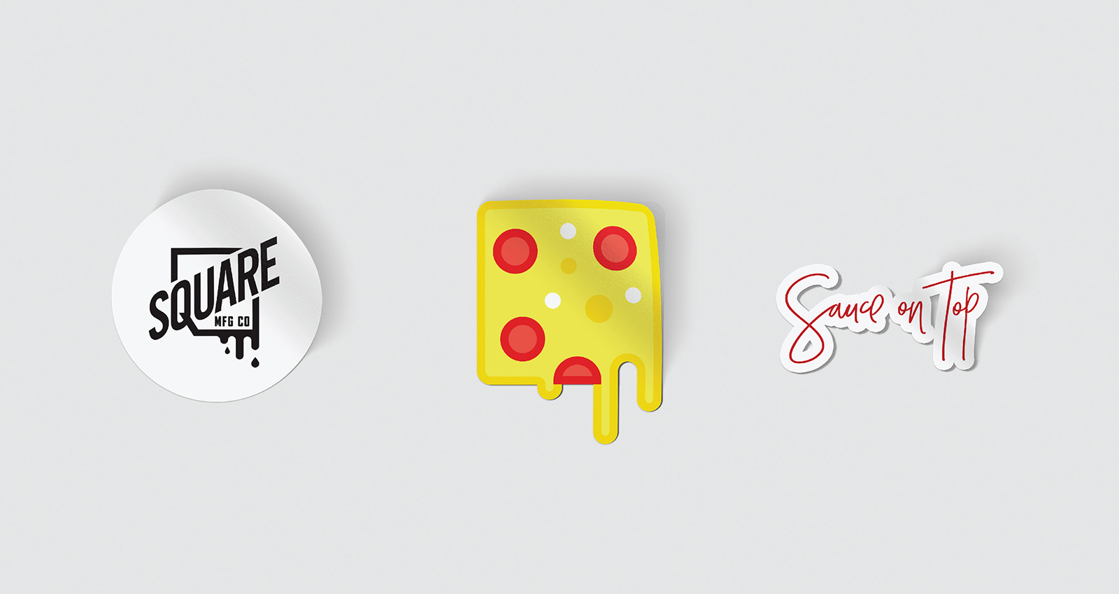
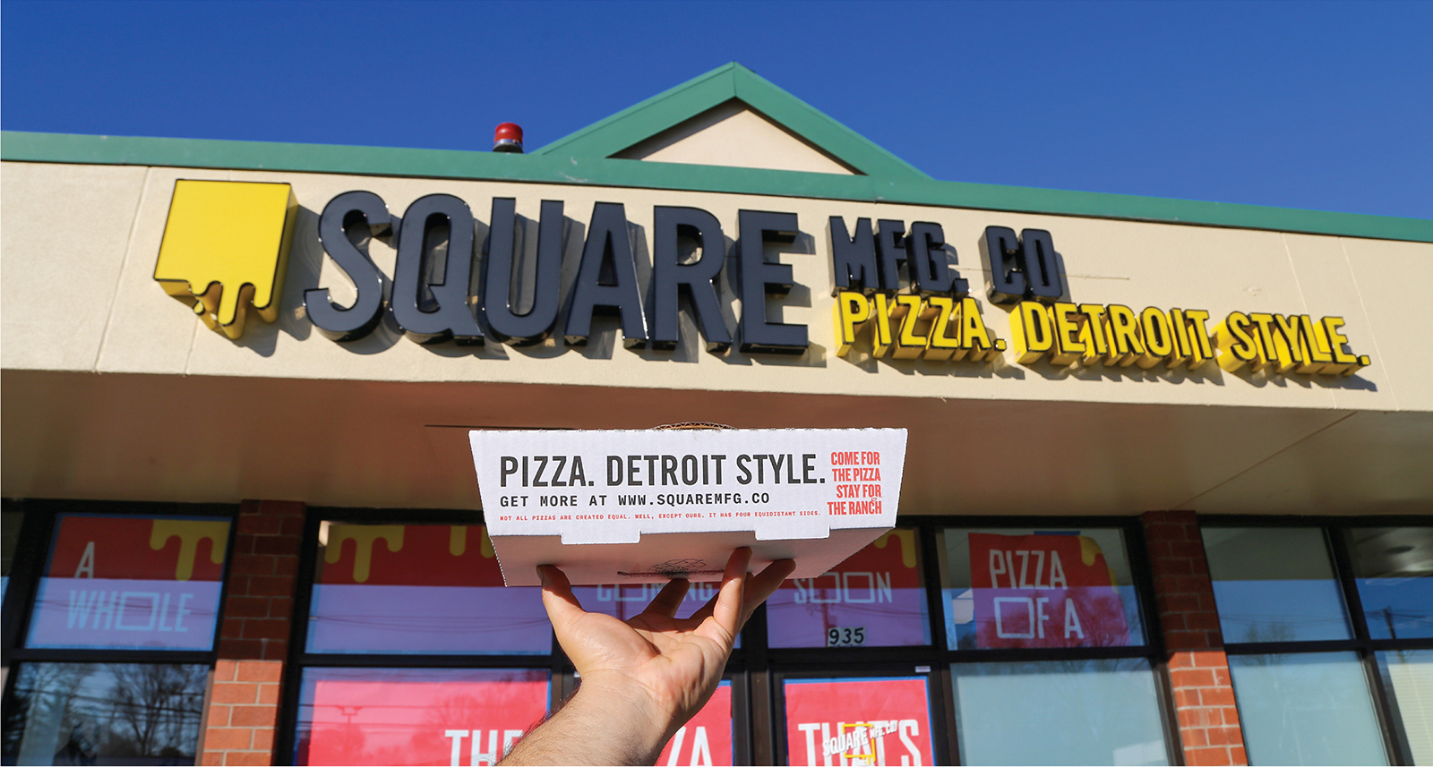
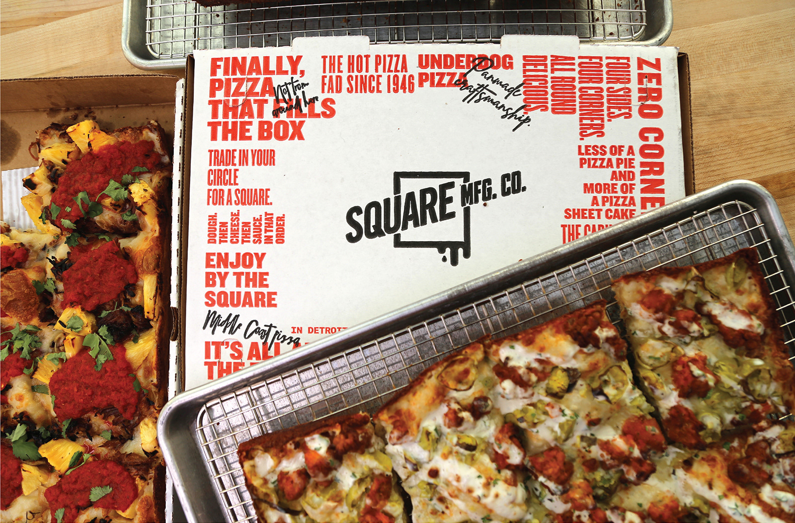
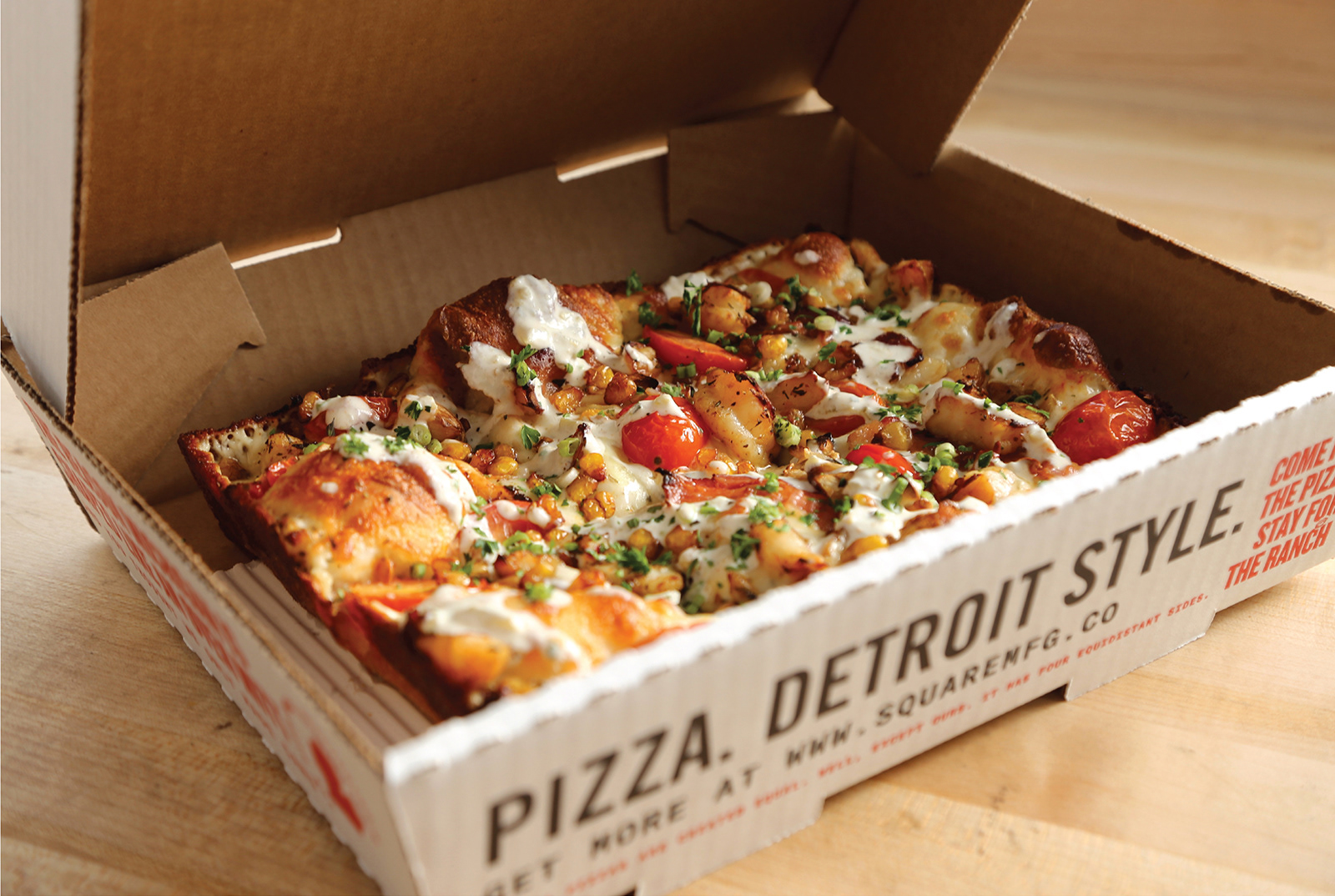
A new pizza shop in the Boston area was getting ready to serve a deep dish tradition from Detroit. Made in seasoned pans over the corse of several days, this pizza is different in many ways (like putting the sauce on top), and deserved a brand that would set it apart.
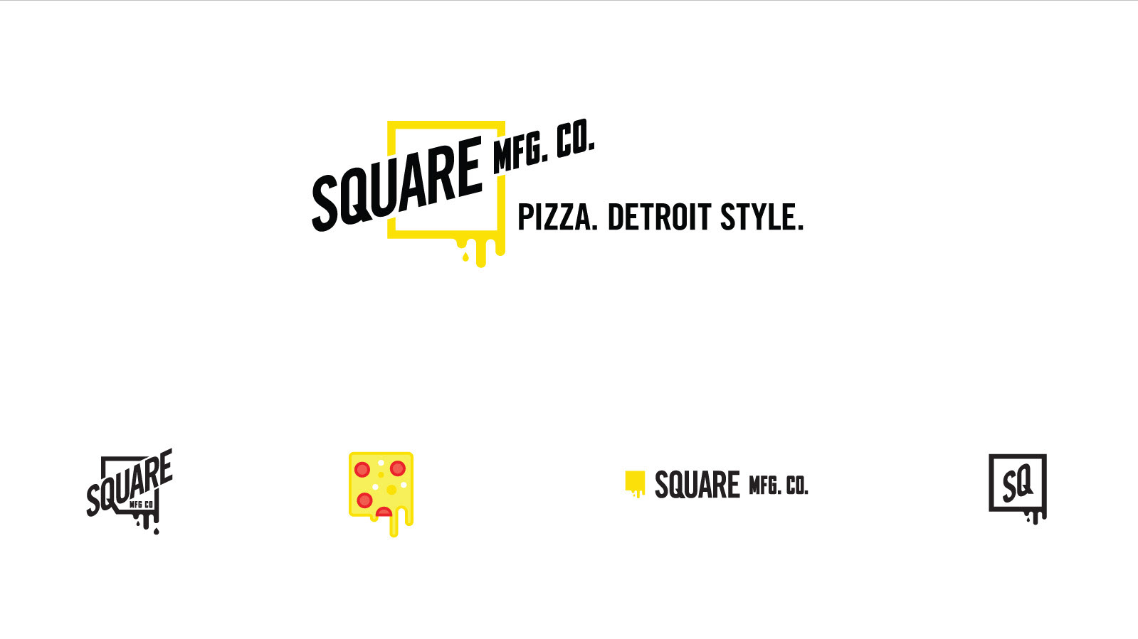
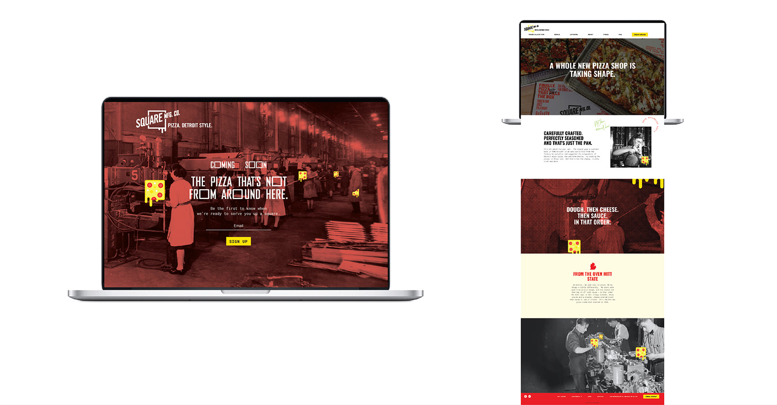
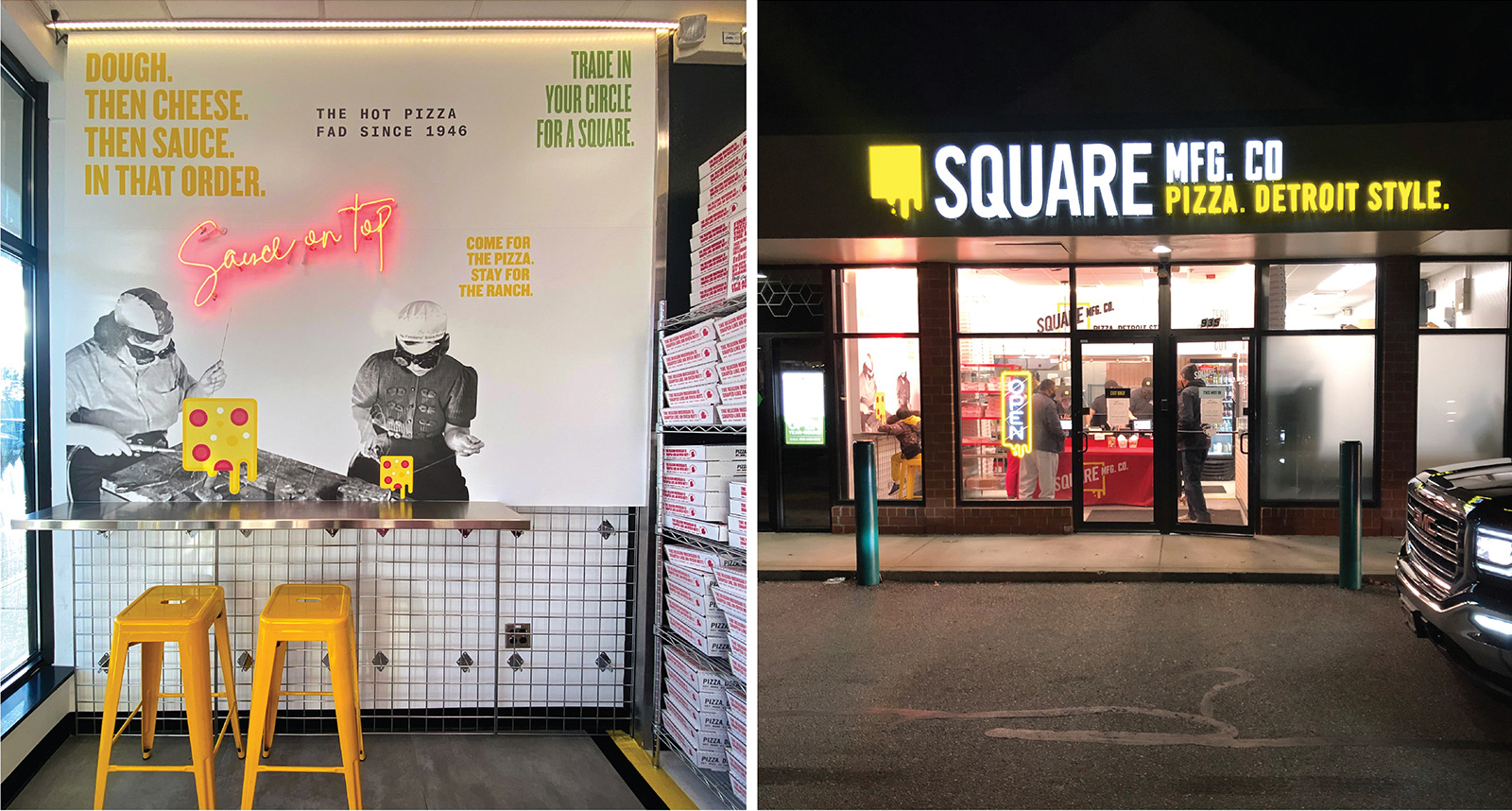
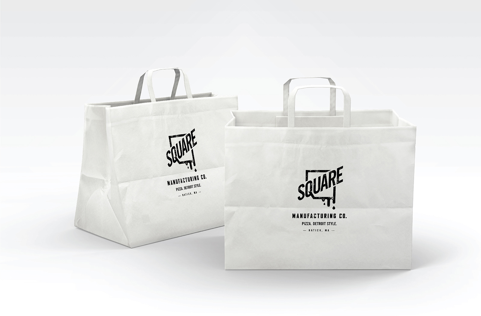
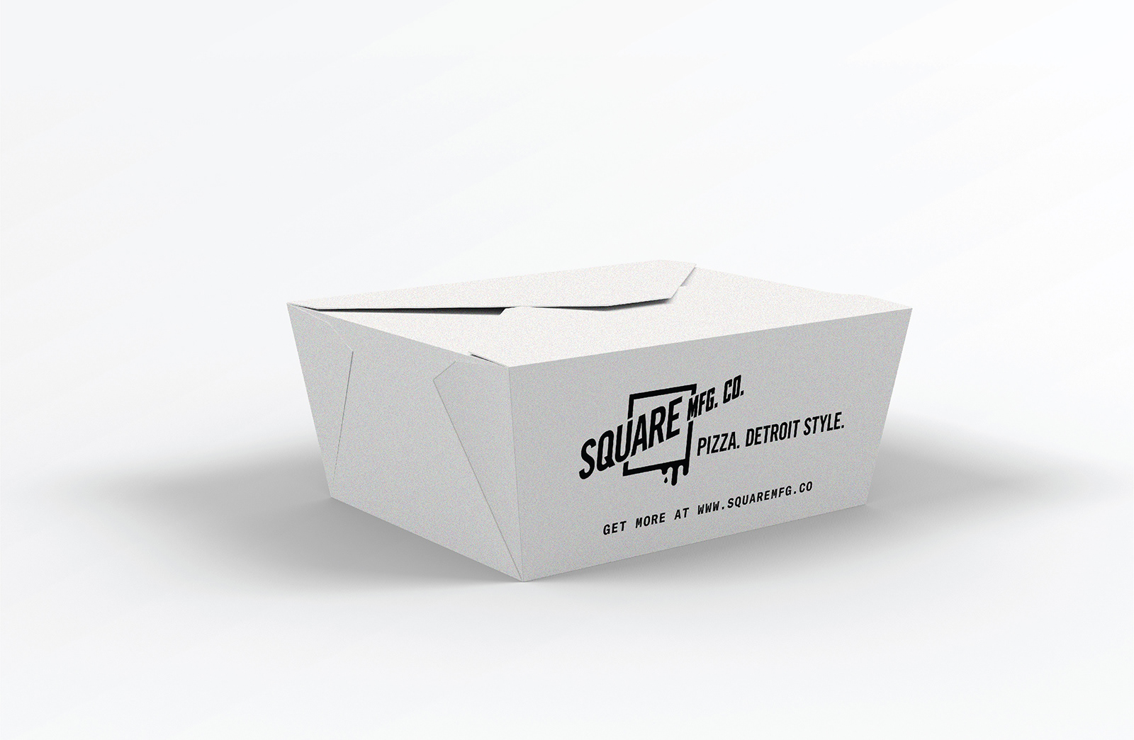
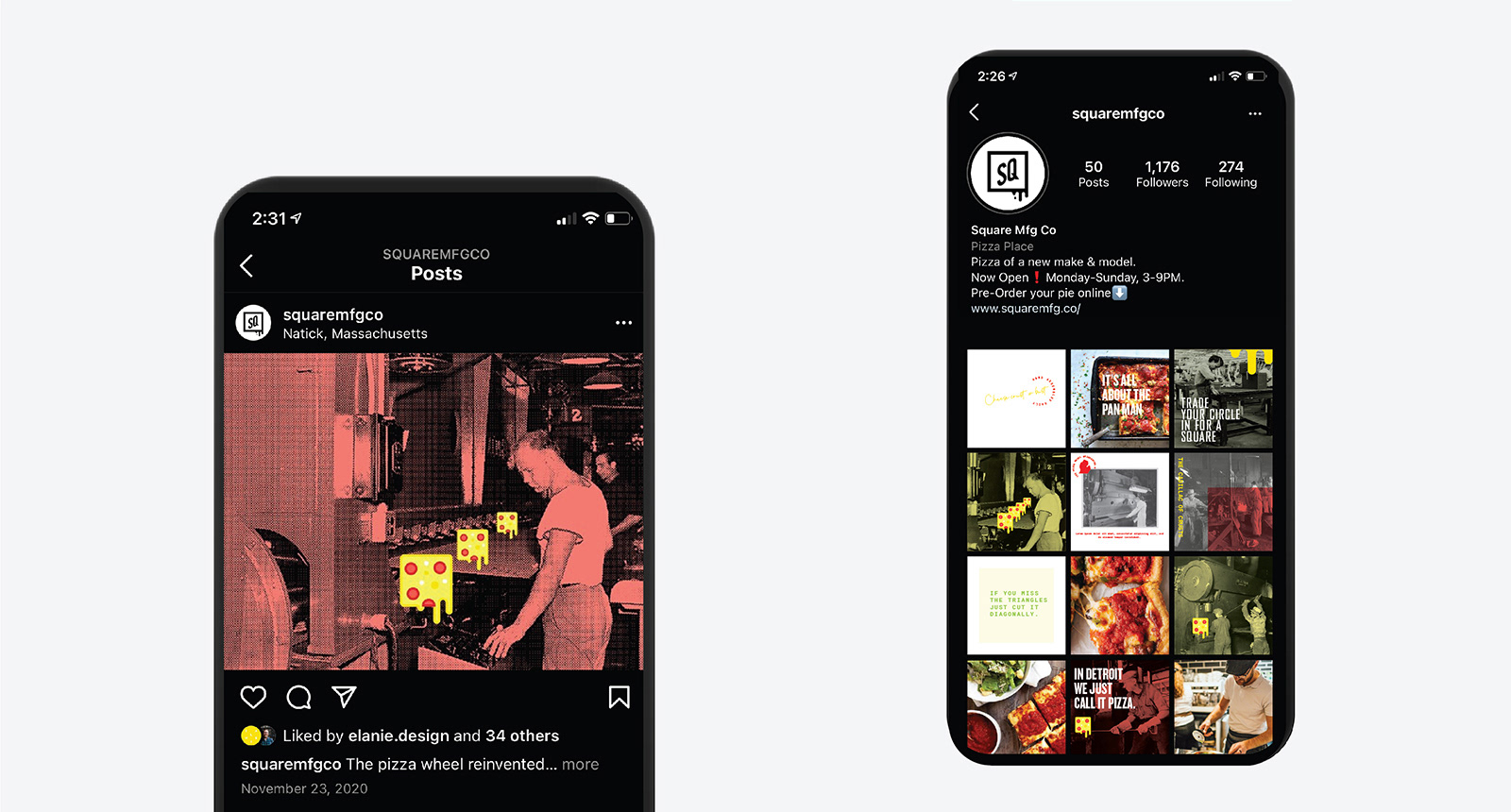
Inspired by Detroit's history, we built the brand around the idea of a factory carefully churning out cheese squares with the same care and dedication found at the turn of the century for American made cars. We used the juxtaposition of old factory photos with our pop-style illustrated pizza-square and clever headlines to tell our story. Our mix of typographic styles takes cues from the early beginnings of punk rock scene 1970's Detroit.
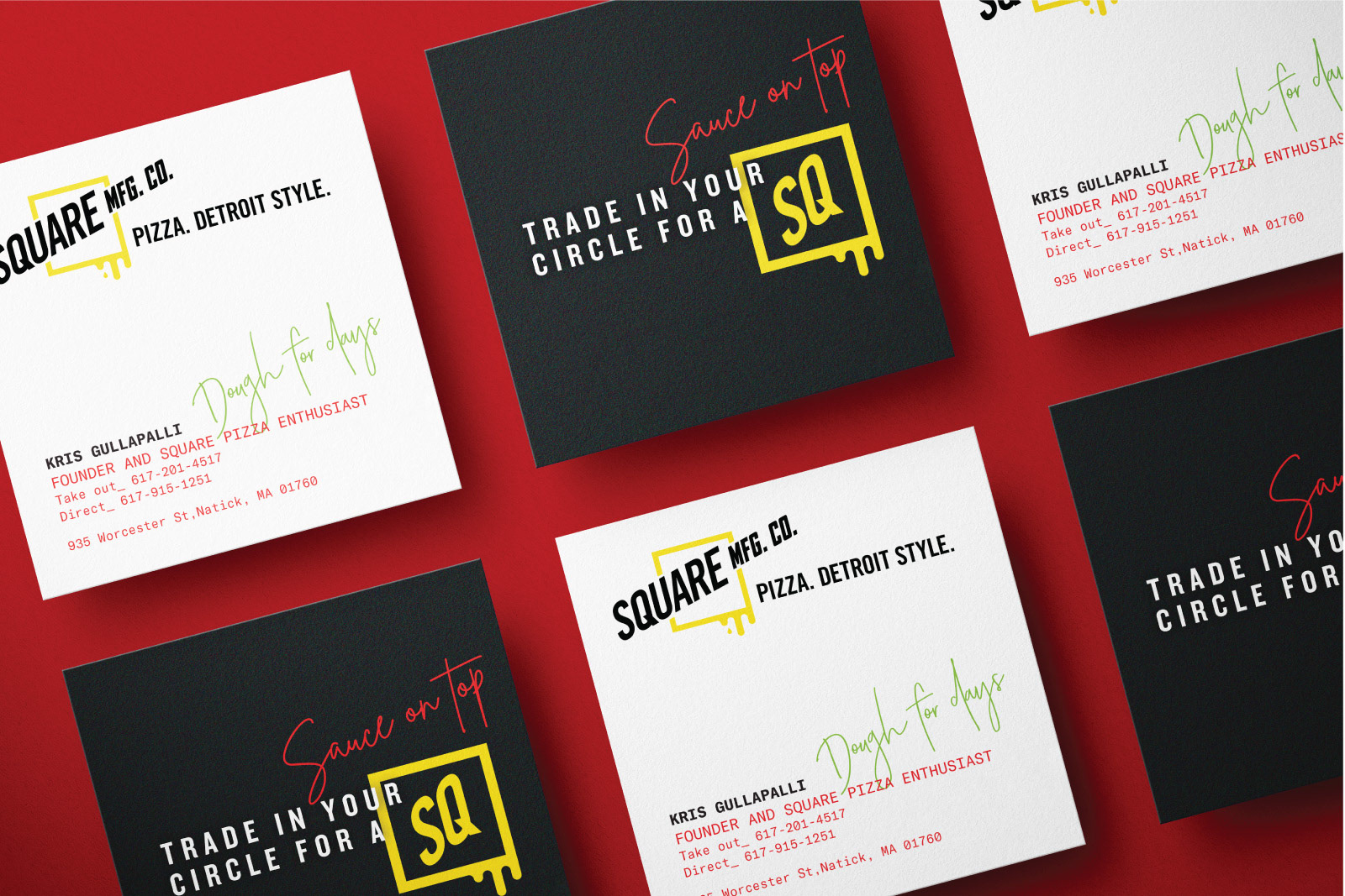
Our work extended into the interior space environmental graphics, menu design, exterior signage and staff attire.
Despite the pandemic, or because of it, this new pizza shop is growing fast, and selling out daily. New locations coming soon.
Collaborators: Joe the Architect for creative direction and interior design. Neon WiIliams for neon lettering and signage. Viewpoint Signs for Standoff menus, Acrylic lettering and exterior LED signage.
Collaborators: Joe the Architect for creative direction and interior design. Neon WiIliams for neon lettering and signage. Viewpoint Signs for Standoff menus, Acrylic lettering and exterior LED signage.